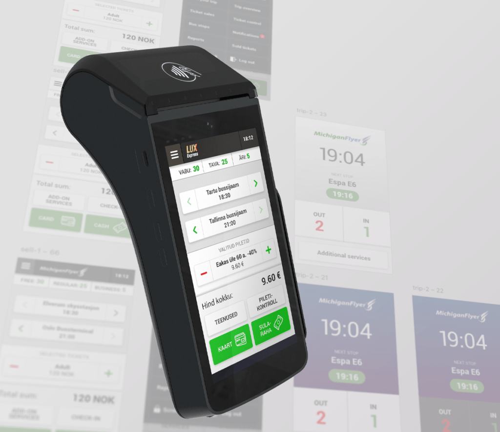
Redesigned the onboard ticketing solution for transportation operators, making ticket sales and validation intuitive, efficient, and cost-effective. Helped drivers to handle operations seamlessly, improving satisfaction and making processes more efficient.
One-Click Sales Machine
Redesigned the onboard ticketing solution for transportation operators, making ticket sales and validation intuitive, efficient, and cost-effective. Helped drivers to handle operations seamlessly, improving satisfaction and making processes more efficient.
My Role:
UX Designer / Consultant
Impact:
Higher NPS
Increased CSAT
Adopted by transportation companies worldwide
Methods:
Research
Flowcharts
Wireframes
Prototyping
Interaction design
Style guide
Team & Collaboration:
Product Managers
Developers
QA Engineers
Bus Drivers (for testing)
Sales
Support
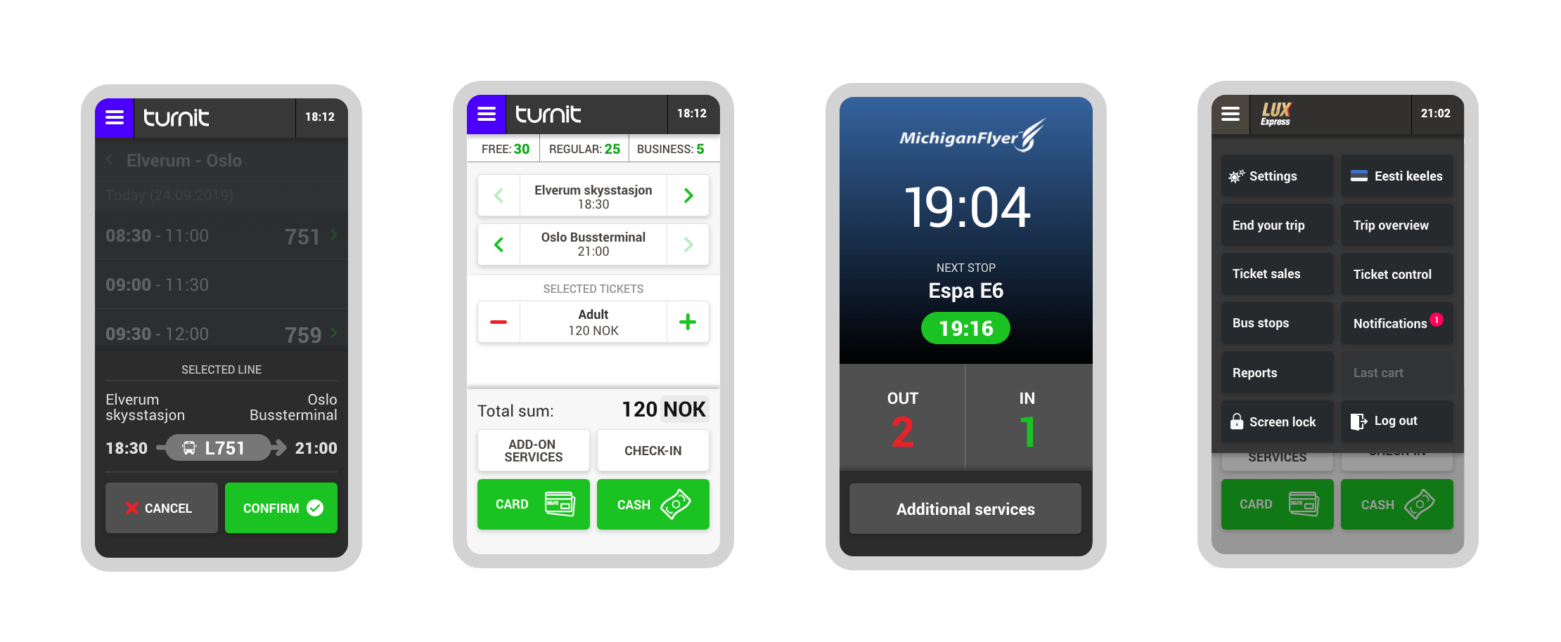
The challenge
The old onboard sales terminal was outdated, complex, and inefficient, requiring two people to manage ticket sales and validation: one for selling tickets and another for validating them. Drivers found it frustrating to use, as it demanded extensive training and lacked basic features like night mode.
Clear goals
1.
Simplify the process so drivers can handle ticket sales and validation effortlessly, without needing extra personnel.
2.
Design a solution that would be intuitive enough to improve efficiency and satisfaction while reducing operational costs.
The Solution
We worked collaboratively to redesign the terminal from the ground up, focusing on usability, efficiency, and scalability.
One-Click ticket sales: Using route data, we designed a feature that allowed drivers to sell tickets quickly with minimal input. For instance, the system pre-filled popular ticket options during common routes.
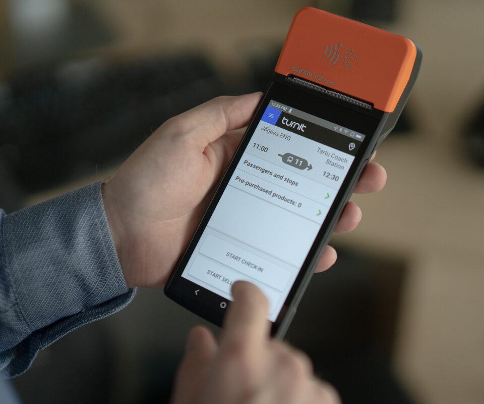
Driver-friendly: Simplified workflows, an intuitive layout, and the night mode made the terminal easier to use in various conditions.
Scalability: The system was built as a flexible platform, allowing customized branding, language, and route configurations.
The Results
Driver satisfaction: The redesign significantly reduced frustration. Driver satisfaction improved significantly, with many reporting that the new terminal made their daily tasks easier and more enjoyable. The system achieved a much higher Net Promoter Score (NPS), showing clear improvement over the previous terminal..
Operational efficiency: By eliminating the need for ticket-checking staff, the solution simplified operations, and reduced costs.
Wide adoption: Today, transportation companies worldwide use the system across city, regional, and long-distance routes.
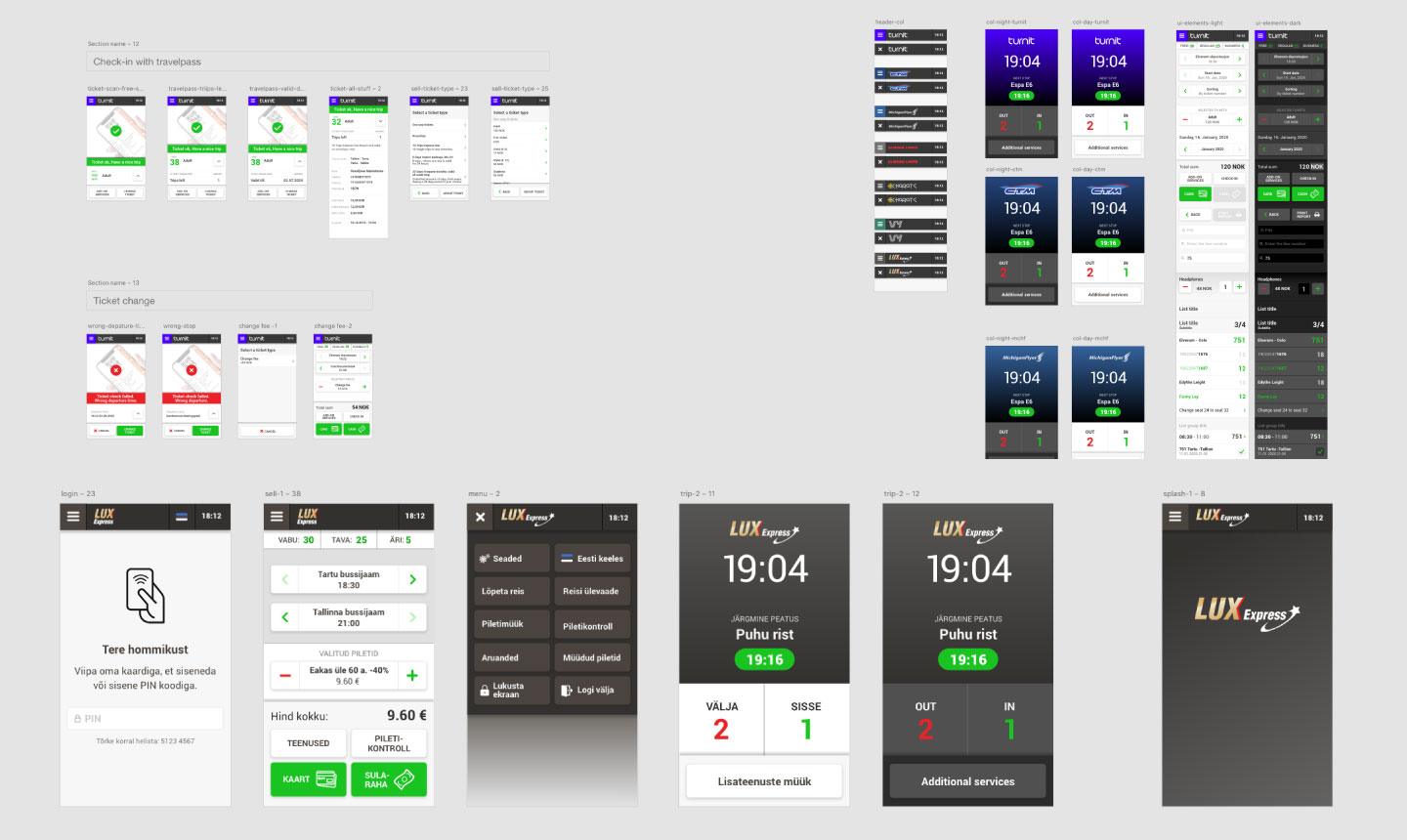
Tools and methods
Understanding the problem
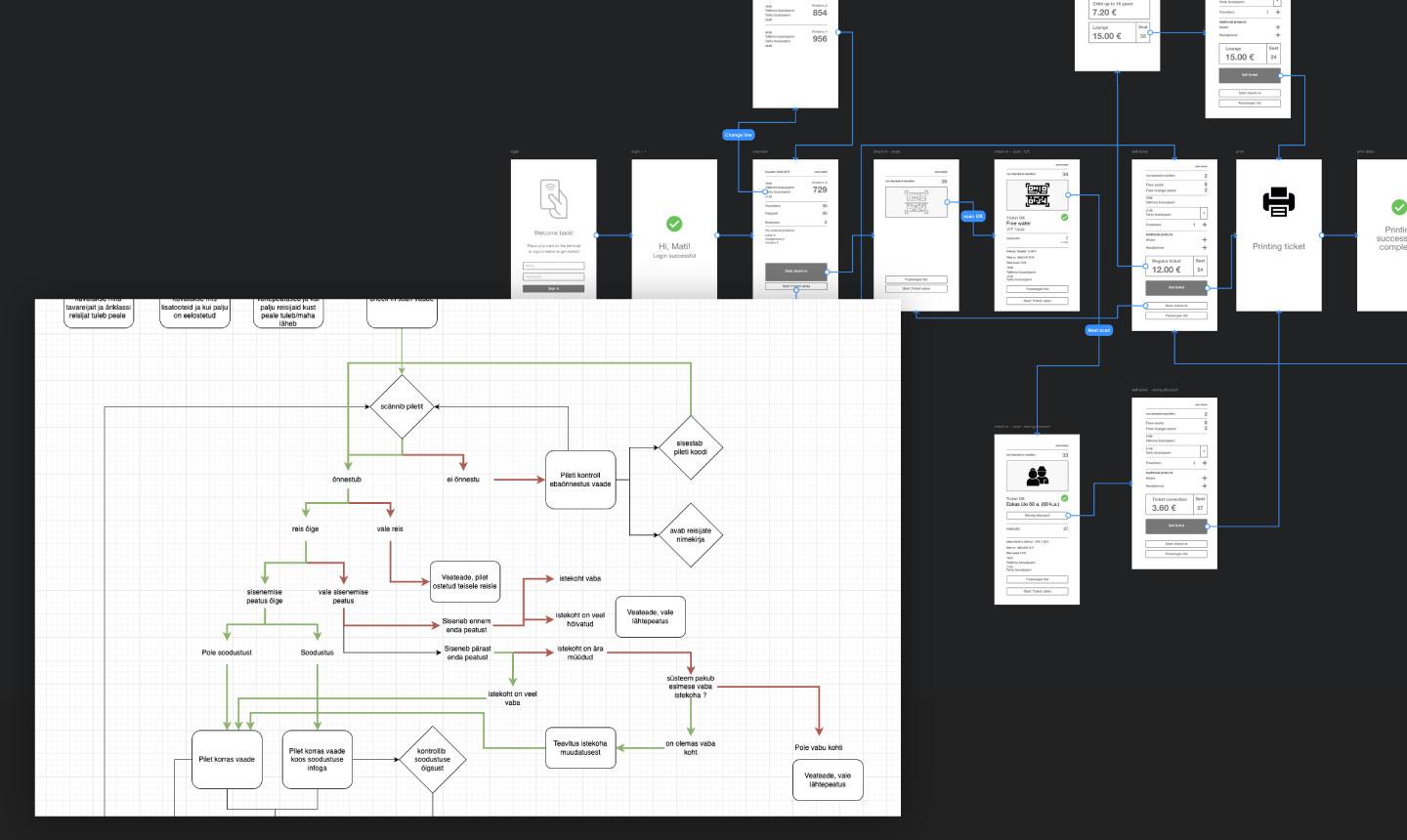
To understand pain points and operational inefficiencies, we conducted interviews and surveys. These provided insights and needs. Using this input, we created detailed flowcharts and conducted data analysis to map the complexities and identify key bottlenecks.
Experimentation & ideation
With a clear understanding of the challenges, we crafted wireframes and interactive prototypes to visualize potential solutions. This allowed us to experiment with different workflows and iterate quickly based on team feedback.
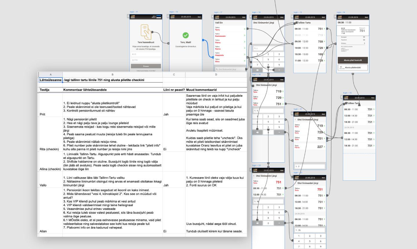
Validating solutions
Testing prototypes with real bus drivers was essential to uncovering nuances and ensuring the system was intuitive. Their feedback guided us to refine the design and make it practical for real-world use.
Implementation & delivery
Once validated, I designed interface, created interaction videos to showcase interactions, and delivered a style guide. These ensured consistency and scalability for operators worldwide.
Thanks for visiting. If you’re interested in creating something impactful or just want to connect, feel free to reach out.